Powder Score Data Visualization
For this assignment, I wanted to focus on something I have always wanted to try, snowboarding. I feel like I missed the perfect window last winter, so I wanted to use data to figure out when the best time of year actually is to go. I used information about the North Carolina mountains such as snowfall, temperature, lodging cost, and crowd levels to create a “Powder Score” for each month. My goal was to visualize when conditions would be the most ideal to finally plan my first snowboarding trip.
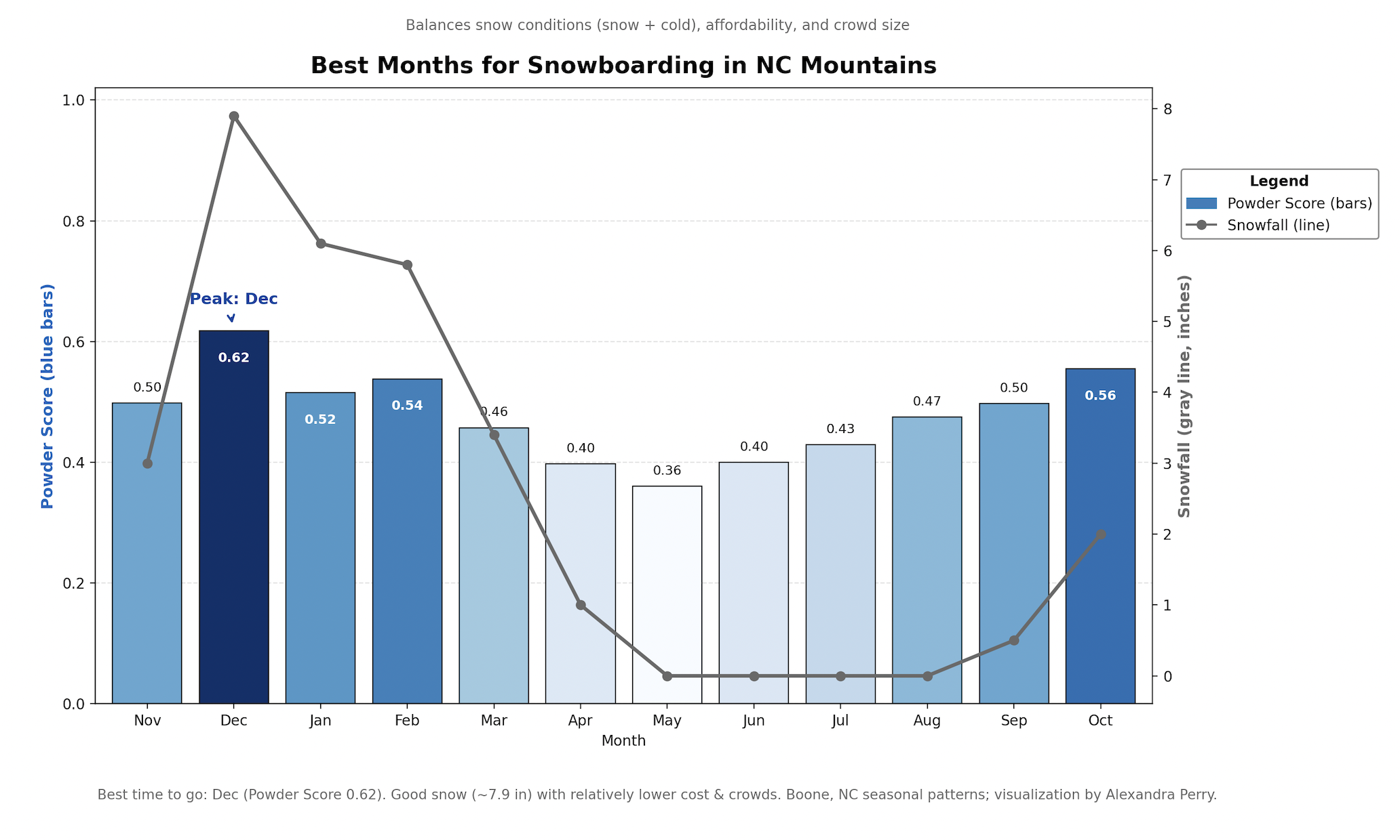
In the beginning, I expected the best time for snowboarding to be somewhere in the middle of winter when it is the coldest and snow is at its peak. What surprised me was how much other factors like lodging cost and crowd levels changed the overall results. For example, I thought January would be the clear winner since it usually has the most snow, but the data showed that December actually offered the best overall balance. It had plenty of snow while still being cheaper and less crowded. I also did not realize how quickly conditions shift between months in North Carolina. This assignment helped me understand that the best time to go is not just about weather, but about finding the right balance between cost, snow, and experience.